Saturday, January 5, 2013

IC370 Start with a Challenge


I’m starting this year off with a challenge!  I needed to make a nurse card today and needed a little inspiration.  Today’s challenge was perfect for me!  I was inspired by THIS image:
 
The tile floor was hand drawn in.  TIP:  Make the horizontal lines straight but angle the vertical lines from a center point to give the illusion of depth.
 
Stamps:  Stamping Bella Booboobella, Autumn Leaves Swirls V:I, Papertrey Ink Faux Ribbon
Paper:  GP 110, Basic Black, Cherry Cobbler, More Mustard
Ink:  Momento Tuxedo Black, Going Grey, So Safron, More Mustard, Riding Hood Red, Versamark
Accessories:  Copics, Glitter Pen, Nestabilities Labels Four
 
Enjoy!
Michelle B.

Sunday, November 11, 2012

Love Shoes


My daughter recently had a birthday. She has been very busy this fall with soccer, volleyball and her very favorite - Dance! I happen to love shoes so I thought I would feature all her activities by the shoes she wears for them. I just stamped the images, colored with Copics and added a little sponging. Cut them to size and placed them on a card base featuring her favorite colors of turquoise and lime. A hit!

Stamps: Pink Cat Studio Sporty Billy, H&M Living the Girl’s Live, High Hopes Settin Sara, Autumn Leaves Swirls V:I
Paper: Tempting Turquoise, Green Galor, GP 110
Ink: Momento Tuxedo Black, Soft Sky, Pear Pizzaz, Pink Pirouette, Basic Grey, So Safron, Creamy Caramel, Tempting Turquoise
Accessories: Copics, ribbon from Pink Hedgehog

Enjoy!
Michelle B.

Wednesday, October 3, 2012

30 Years

30 years.....how long since I posted last! No, not really but it feels like it! Life has just been me running as fast as I can! I'm sorry and I'll try to be back more regularly.

I really made this card as a 30th anniversary card. I love this little chef and believe he can be used for just about any occassion. I used my Cricut to cut out the black layer, the pattern paper layer, and also the "30". I colored the chef and cut him out (and when I realized I was going to have to cut out his mustache I was thinking maybe this wasn't such a good idea!!!). This all went together really quickly.

Stamps: SU Voila
Paper: Papertrey White, SU Mocha Morning DP, Basic Black, Real Red
Ink: Momento Tuxedo Black
Accessories: Copics, Cricut & Storybook Cartridge


See ya soon!
Michelle B.

PS: My photography skills clearly need to be brushed up on!

Tuesday, April 24, 2012

Harry Potter Starring Billy

I needed a Harry Potter card for my nephew's birthday. Now, I could have purchased an appropriate image, however, that would have given me a creativity score of zero today. So I asked Billy to star in my card (and he agreed!). To get Billy into costume, I drew in the glasses and scar on his face and added a magic want. I also used the graduation gown and added a tie and scarf. I sketched these items in with a pencil first, drew over the pencil sketch with a fine marker, and then went back and erased the pencil lines with a white art eraser.

I love stretching my stamps to be something other than the obvious! I hope you'll give it a try too!

Stamps: Pink Cat Studio Dress Up Billy, Pink Cat Studio Lily and Billy Accessories, Pink Cat Studio, Limitless Limbs, SU One of a Kind (sentiment)
Paper: Whisper White, GP 110, Basic Black, More Mustard, Bravo Burgundy
Ink: Momento Tuxedo Black, Baja Breeze, Night of Navy, Close to Cocoa, Early Espresso
Accessories: Copics


Enjoy!
Michelle B.

Tuesday, April 17, 2012

I did it!!!!


Not a stamping thing but I just have to say "I DID IT!!!!". I ran the Go St. Louis half marathon (that's 13.1 miles). I finished in 2 hours and 20 minutes (great for me!). It was an AWESOME experience and I'm planning to do at least 1 more this year.

Enjoy! (and get some exercise today)
Michelle B.

Saturday, April 7, 2012

Card Buddies


In just one more week, I'll be running my first half marathon! The training schedule has left me little time for stamping. To make good use of the time I have, I have started a "card buddies" program.

When I look over the list of people I need to make cards for this year, I find that there are many people with similar interested that don't know each other. For example, my husband and I both have someone in our families that like deer hunting. They become card buddies. I just need one deer hunting design, and I make two cards. This saves me time in both the design and production of the card. I also have the 2nd card ready and waiting for the event so saves me a little last minute stress too.

If I don't have an immediate need for a second card, I make it anyway and keep it generic. In this case, I am making this card for my in-laws for Easter. I don't know yet what I'm going to do with the 2nd card so I used a more generic sentiment. Hope you'll give this concept a try.

Now, for this card, I was inspired by THIS piece of artwork. I stamped the flowered branch and colored it in a bit with Copics. I them clear embossed the image TWICE (to make sure no green came thru). Then I sponged Sage Shadow starting at the outside of the image and working to the center so it would be lighter at the center. Finally, I sponged a little Chocolate Chip around the edges.

Stamps: SU Easter Blossoms, SU Clearly for You
Paper: Whisper White, Sage Shadow
Ink: Momento Tuxedo Black, Sage Shadow, Chocolate Chip
Accessories: Copics, Versamark pen, clear detail embossing powder, heat gun, ribbon from Mike’s, Stamp-a-majig


Enjoy!
Michelle B.

Thursday, February 16, 2012

Running at Sunrise

My husband and I work at the same place. We recently joined some co-workers that run over our lunch hour 3 days a week. We also try to do a little longer run on Saturdays. Last week I logged 17 miles (my all time high!) and had a blast! I knew I wanted to make him a running card for his recent birthday. I didn't find a lot of running images out there...especially for a man. Luckily, I have the Cricut Sports Mania cartridge that has a running man image.

Now I needed a scene to put him in. I choose to CASE the background in THIS fabulous piece by Michelle Zindorf. I did notice that I don't like a lot of lines showing in my direct to paper pieces so I caught myself swirling the ink pad a bit to make it just a little smoother. As I always do with silhouettes, I gave the man the silhouette treatment!

Enjoy! (and get some exercise today!)
Michelle B.


Sunday, January 29, 2012

Too Lazy to Color

I wanted to use this image for a birthday card for a family member who loves shopping. I didn't feel like coloring all that background. So, I was thinking that these were pretty nice straight lines in that background so maybe I could mask and sponge it all in. I think it worked great!
Here's the image with the sidewalk and brick wall already sponged. I'll show you how I did this on the window.
I used sticky notes to mask off the area outside the window. Notice that I let those black lines along the bottom and left side of the window show. You can never sponge right up to the edge of the sticky note....this little black line is just the right amount of spacing to keep you from having a white edge there.
I sponged in the blue ink. Its a little hard to see here but I ALWAYS start sponging on the sticky note and work in a circular motion towards the center of the image. This keeps me from getting any harsh areas of color. Everything is nice and softly faded.
Here's what it looks like when I remove the sticky notes.

And here's the finished product again. I paperpieced in the lady. For the sketch I used SCS Sketch Challenge #369. Oh, and I used a fine black marker to draw in the cracks in the sidewalk and a few bricks.

Stamps: My Favorite Things What A Girl Wants
Paper: Whisper White, GP110, Night of Navy, Basic Grey Marrakech DP
Ink: Momento Tuxedo Black, Basic Grey, Really Rust, Soft Sky
Accessories: Copics, Versamark, gold embossing powder, fine black marker, Crystal Stickles

Enjoy!
Michelle B.

Monday, January 16, 2012

Not too late for a calendar.....

Its only the middle of January so you have 11.5 months to go, right? I did make these for myself and my boss before we returned to work from the Christmas break. This is very similar in style to the calendar I made last year as that one just worked out so great (my post is here).

CALENDAR PAGES: The calendar pages are again from Cat (again, used the CD pages and cut them down). You can find those HERE.

DIRECTIONS FOR BASE: Cat also referred me to some great directions I used to put the base of the calendar together. You can find those HERE.

So get comfy and lets look at all these pages!

JANUARY: Stampin' Up Snowfall
January is so much prettier in real life...I just couldn't capture the sparkle of the Stickles.


FEBRUARY: Artful INKables Into the Moonlight
We are both Twilight fans so I figured why not use a Twilight image for the romance of Valentine's Day.

MARCH: Treehouse Stamps My Lucky Charm
I think this one needs something....should have added glitter!
APRIL: High Hopes Easter Basket
After I made this one....I realized I didn't check to see if Easter was actually in April this year! Shew, I'm lucky that it was!

MAY: CC Designs Sugarplums Olivia's Birdies
(lesson learned this year was don't be afraid to mask off the bottom of the stamp like I did here to the bottom of the bird bath....I like the look!)


JUNE: Artful INKables Pond Friends
I love that little fish. HERE is a tutorial on how I did this fish tank technique.


JULY: Oops, can't remember what star I used!
Again, I think I need glitter!


AUGUST: Stampendous Hey There Cupcake
Both of our birthdays are in August so why not a birthday theme. (see, glitter makes it!)


SEPTEMBER: Stampin' Up Trendy Trees
Again this year, September is my favorite! This was inspired by THIS post.


OCTOBER: CC Design Sugarplums Halloween
This was inspired by THIS post.


NOVEMBER: Stamping Bella Chefabella
See, I masked the bottom of the image off and again I like the look.


DECEMBER: Stampin' Up Welcome Christmas
I was inspired by several pieces on Splitcoast Stampers that used this image as an ornament.


Enjoy!
Michelle B.

Sunday, January 8, 2012

Earrings and earring cards


(sorry, not the best pic!) Each December, the 8th grade scouts at our school host a "Santa Sale" to allow all the students in the school to purchase inexpensive Christmas gifts for their families. The other grades at the school contribute hand made items to the sale. This year our troop made over 65 pairs of french wire earrings. I needed a way to package them inexpensively so the children could get them home. I decided to cut cardstock into pieces, punch holes to put the earrings through, and tape them to the back to secure. I stamped "Merry Christmas" on the front for just a bit of decoration. Where there is a need, there is a crafty solution!

Supplies: Riding Hood Red Ink, Double Rectangle Punch, sentiment from The Angel Co.

Enjoy!
Michelle B.

Monday, January 2, 2012

Who Made This Mess??!!??!!


Hi and Happy New Year! I am so glad to finally get some time to stamp and work on my blog. This photo is a pic of my stamp area around Thanksgiving. As you can see, it is a total disaster and I'm afraid to say that almost all of this mess is mine! It was so bad that one day I walked in and shocked myself. I said "Did I do that?" Late summer and fall were filled with carpools to dance, soccer, baseball, and volleyball so I was rarely home (as I work full time also). All crafting time was done at the speed of light with no time to pickup (or that's my excuse anyway). I have now cleaned up a bit, heavy sports are over and I'm ready to spend some time sharing some project with you. I'll be back soon.


Enjoy!
Michelle B.

Sunday, July 10, 2011

FS231 Off to Camp

DD leaves for a week of camp today. I needed to quickly make a card to drop off so it could be delivered to her thru the camp mail. I found the perfect inspiration in THIS piece from today's Featured Stamper. I loved the simplicity of the woods in the background. It was hard for me to make a scene an keep it simple but I restrained myself! The two things I changed from the inspiration piece were the addition of the little girl and also the ribbon color (I just had to have some blue up there for the sky!).

The tree images were stamped and I used a sponge to color them in. I used a blender pen to color the tree trunks. A torn piece of paper was used as a mask to sponge in a little ground.

Stamps: The Greeting Farm Audrey, Lovely as a Tree, sentiment by Innovative Stamp Creations
Paper: Whisper White, Old Olive, Basic Grey Offbeat DP
Ink: Momento Tuxedo Black, Old Olive, Pear Pizzaz, Creamy Caramel, Close to Cocoa (sentiment)
Accessories: Copics, Blender Pen, ribbon from Pink Hedgehog


Enjoy!
Michelle B.

Wednesday, June 22, 2011

I *LOVE* Versatile Stamps


I just *LOVE* versatile stamps like this one. This example shows how I used her for DD's Easter card. I could have had her painting just about anything....snowflakes, a Christmas tree, a birthday cake, a car, a dog, a soccer ball, whatever the receipient of your card is into. You can really stretch your stamping budget by considering the versatility of a stamp like this. You know you'll use it many times!

I've also been experimenting a lot with DP lately. What? You haven't seen me posting any of them? Uh, that's because I haven't liked very many of them!

I'll be back soon with another versatile stamp example.

Stamps: Stamping Bella Artistabella, Stampin Up Easter Blossoms
Paper: GP 110, Gasic Grey Urban Prairie, Craft, Marina Mist
Ink: Momento Tuxedo Black, Kiwi Kiss, Marina Mist
Accessories: Nesties, Cuttlebug Textile embossing folder


Enjoy!
Michelle B.

Thursday, June 2, 2011

Bookmark swap and beyond


I made this for a bookmark swap I participated in (wow did I get some cool ones back!). I finally got my hands on that elusive Branch Out stamp set. I had tried to order it before it retired but I was too late. Finally, I found a decent deal on ebay!

Sometimes when I need some inspiration, I turn to the internet and look at some art. This bookmark was inspired by THIS piece of art.

I started by stamping and clear embossing the swirls at the top and bottom in River Rock. I used a torn piece of paper as a mask and sponged in the Really Rust and a bit of Espresso around the edges. Next I stamped the tree in Espresso. I sponged in the Pear green area of the tree and stamped a few leaves in Pear and Rust. I sponged River Rock in the mid sky area (and didn't really worry too much about it touching the other areas). The Marina Mist upper blue sky was sponged in next (and I was careful not to mix it with the River Rock as didn't want it to turn green). Finally, I stamped the text in with Espresso.

I made a few more than required for my swap (in case I messed one up) so I was able to use an extra to make a quick card.


Stamps: Stampin’ Up Branch Out, Papertrey Ink Text Style, Autumn Leaves Swirls V:I
Paper: Whisper White, Early Espresso
Ink: River Rock, Versamark, Really Rust, Early Espresso, Perfect Pear, Marina Mist
Accessories: Embroidery Thread, Ribbon from Pink Hedgehog, Tab punch, large brad, Crop-o-dile


Enjoy!
Michelle B.


Thursday, May 26, 2011

Football Jersey


Here's a football jersey made as a birthday card but I thought it might also be good for father's day. You can easily change the colors to your guy's favorite team colors. The template for the shirt can be found here. I made a "V Neck" using a square punch instead of a round neckline and didn't put any curves in the waist. I used my Cricut to cut the number (it was for an 8th birthday). I used my square punch to cut the trim around the neckline and just hand cut the stripes on the sleeves.

Enjoy!
Michelle B.

Wednesday, May 25, 2011

Has it really been so long?


Where have I been? Well I have been busy fulfilling a long time dream.....to run a 5K (that's 3.1 miles). Yes, as you can see from the pic, I DID IT! Yippee! I started training in January and ran the race in May. Along the way, I lost 12 pounds too! If you are interested in trying this, check out the Couch Potato to 5K Plan I followed to get me started (there is an iPhone app also). I'll be back tomorrow with a card for you.

Michelle

Thursday, April 14, 2011

First Communion & "Ray" Tutorial

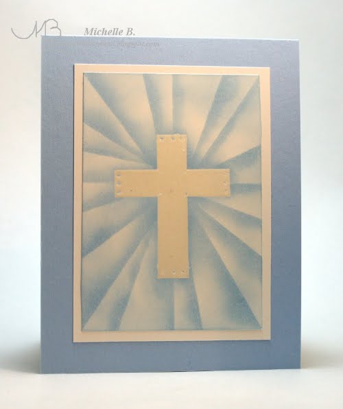
I made this for my son who will be making his first communion in a couple of weeks. I thought this would also be an nice Easter card! I started by clear embossing the large cross image. I then sponged just a little bit of blue around the edges of the cross (from the center outward). Be sure to always wipe the ink off your embossing frequently during this process! Warning: terrible pictures ahead but I think you'll get the idea! To make the "rays" you'll need a trusty sticky note! I like to imagine my piece is a clock and the sticky note is the hand that is anchored in the center. I start with the hand at 12 o'clock (straight up) and sponge a little blue ink from the sticky note onto the piece. I then move the sticky note a few "minutes" ahead, pivoting from that center point, and sponge again. Work your way all around. If you do not "think like a clock" you'll end up getting confused which way the rays are supposed to go and end up sponging some of the rays in one direction and the rest in a different direction (trust me). It may also be helpful to do the 12, 3, 6, and 9 positions on the clock and then go back and work your way all the way around the clock.
Stamps: Treehouse Stamps Count Your Blessings Paper: Bashful Blue, GP 110 Ink: Bashful Blue, Versamark Accessories: Clear detail embossing powder, sticky note

Enjoy!
Michelle B.

Tuesday, March 29, 2011

B-I-G Flower

A bit of an optical illusion going on here....this flower seems to be jumping off the page but the flower and the white background are all one layer! (the green card base is the only other layer) I colored the flower with Prismacolor pencils. I did not use any kind of Gamsol or blending medium of any kind. I colored the area with the lightest color and then moved to the next darker color and blended the edges with the lightest color. I then moved to the next darkest color and blended with the lightest again. Coloring the entire area in the lightest color first, put a waxy layer down over the area that allowed me to move the darker colors around a bit when blending. Here's the colored flower and the pencils I used. Now it needed something else.....hmmmm....I created a mask out of another sheet of cardstock and sponged some River Rock all around the edges of the flower working from the center outward and going especially dark on the areas that indent closer to the center. (I had to move the cardstock around a bit to get really close to the flower because the thickness caused a gap.) That looked good but I needed something else. I love text in the background and I love when its not completely uniform. So, I took advantage of that thick mask and stamped the text in the background without pushing down too hard. That thick mask and light pressure kept the text away from the flower a bit. Loved this now! It was sent to my Mother-In-Law for her birthday (and in keeping with my goal this year, I had it done several days early!).

Stamps: Stampin Up From the Garden, Papertrey Text Style
Paper: Perfect Pear, Whisper White
Ink: Momento Tuxedo Black, River Rock Accessories: Prismacolor Pencils, SU Certainly Celery Ribbon, Crop-a-dile Corner Rounder


Enjoy!
Michelle B.

Sunday, March 20, 2011

Outer Space Tutorial

I tried to describe how I made the outer space scene the other day and as I was writing it down, I was thinking "I really need a visual for this". So, here we go:


First I used Versamark ink and a dot stamp from Itty Bitty Backgrounds to place little dots all over the piece. Oh, the cardstock is Stampin' Up Whisper White which I love for sponging because it has a slightly slick surface that lets me move the ink around a bit. I covered the Versamark with clear detail embossing powder and heated to emboss. These will be the stars.

Next I sponged some Pacific Point kind of randomly. I made a line across the top and a "V" shape across the bottom. Always wipe with a paper towel after each inking to keep those white spots white!


Both above and below the Pacific sponged lines, I sponged Not Quite Navy.


Both above and below the Not Quite Navy, I sponged Night of Navy.


Finally, I added black all around the edges and heavier into the corners. Ta Da! You are all set to put this piece into use in an outter space card like this one:


Enjoy!
Michelle B.

Thursday, March 3, 2011

Calendar


As part of my "not being with it" in the past, I waited until January to make a calendar! Why am I showing this to you today.....in March? Because the 2012 templates are out and we can get a head start on next year!

I found the calendar template on SCS (click HERE for 2011 and HERE for 2012). I printed them off my computer onto some GP 110 cardstock. I cut them to the size I wanted (just made up a size that centered the calendar in the bottom and left stamping room at the top).

The idea for the physical structure of the calendar came from THIS blog posting. I loved that paper insert and it works amazingly well (and made it easy for me to fold this an take it to work).
Here's the rest of the calendar pages include a side shot of the structure. In case you are wondering....September and October are my absolute favorite!

PS: January uses Clear Dollar Stamps Snowman Wishes and my Snow Drift Tutorial is here.


February: Stampin' Up Happy Hearts


March: High Hopes St. Pattys Day Hat


April: Pink Cat Studio Limitless Limbs


May: My Favorite Things Bundles of Bouquets

Check out my Ground Sponging Tutorial I used here.


June: My Favorite Things Can Ya Dig It?


July: Verve Up, Up and Away


August: Hanna Stamps Pool Party


September: Papertrey Ink Through the Trees


October: Gina K. Spooky Silhouettes


November: Stampin Up Voila to Go and you can see my Table Tutorial HERE (except that I had to sponge in the base color first instead of using a piece of cardstock).


December: Papertrey Ink Take a Bough

And here's a side shot of the structure.


Enjoy!
Michelle B.