Tuesday, March 31, 2009

Tips n Tricks Tuesday # 6 - Adhesives & Removal Too!

Wow, being a featured stamper on SCS was a worldwind of fun! There were some awesome ideas out there! Thanks to everyone for their support. I have one question tho: How come if I was featured, I came away with a list of ideas and a list of stamps I want to buy? Ha! That was an unexpected side benefit.

Ok, so, last week I told you how to cut out those images. This week I'll tell you how I stick those babies on. I have even had people contact me after receiving one of my cards to find out what type of adhesive I use because the images are so well adhered. So, here we go.

Now for the big boring square pieces of cardstock, I use an ATG 714 gun. One problem I noticed with that is that sometimes I ran off the edge of my cardstock a bit and I'd get glops of adhesive showing on the front of my card like this:


There is a simple solution from Stampin Up called an Adhesive Remover and it runs about $2. You simply rub this gently over those glops and it takes them right off. After several uses, it gets kind of dirty looking so you just take a scissors and cut that yucky area off. I've had this one about a year so I'm thinking its gonna last FOREVAH!


Now, for my beautiful little main images or other parts of my card that may be small pieces or odd shapes, I use Tombow Multi Purpose Adhesive available from All That Scraps or Stampin' Up for under $4 a bottle. One bottle lasts me many months. I have heard that many people don't like this adhesive because it always gushes out the side of their image leaving a mess on their card. I have never had that problem with the way that I use it. First, while working on a scrap of cardstock, I turn my image over and squeeze some glue out on the backside.

Then I take a Q-Tip and spread the glue around so that only a thin layer remains on the image and any excess is pushed off the image and onto the scrap. Your image should just be shiny with no white areas of adhesive. You can see that this Q-Tip is also well loved and actually works better with all those layers of glue on the end. I simply store it by sticking it to the side of a pencil holder I keep on my work surface.

Now my image is ready to place onto the card. If I happen to get a little of this Tombow adhesive showing on my card, I wait a few moments for it to dry a bit (this adhesive is repositionable when dry) and I rub it off gently with my Adhesive Remover. Be careful here as your cardstock may be damp from the adhesive and will tear easily. I almost DAB rather than RUB here.

One other thing....if you are glueing multiple images, be sure to move around on that scrap so you don't place an image down on top of some excess glue. Been there done that!

Enjoy!

Michelle B.

"Queen of the Scene"

Sunday, March 29, 2009

Today's Featured Stamper Challenge FS112

So, I'm at the Magic House (a local children's museum) last night "camping" with my 17 girl scouts and it's about 1:00 am. I'm getting all tucked into my sleeping bag on the hard floor and I'm thinking I'll just check my phone to see what's going on over at SCS while I'm waiting for the girls to fall asleep. Imagine my surprise when I received a PM that I was today's Featured Stamper! I was so excited that I had NO problem waiting for those girls to fall asleep. In fact, I was up an hour later than the girls!

I intended to make a card to post here with this announcement but I just kinda stood looking at my stamp table in a state of shock. Hopefully I'll snap out of it soon! Ha!

So far this has been a fun filled day showered with compliments and honors! Thanks everyone! Now I'm off to do some commenting in the gallery!

Enjoy!
Michelle B.
"Queen of the Scene"

Saturday, March 28, 2009

IC173 WSC74 Iris

Boy was I excited when I saw the inspiration challenge for today! A Painter! Since I do a bit of painting myself, this was particularly inspiration for me. I loved so many of her pieces but I selected this one to case. The Weekend Sketch Challenge #74 was a perfect match.

I stamped the iris onto the Basic Grey DP. I colored using Copics. I then drew in some grass with my Copics (use a light, medium, and dark green for depth and start drawing at the bottom and "flick" at the top to get that point) . I added a little soft sponging of Sage and Eggplant to the bottom of the grass line to make it coordinate with the distressing at the top of the DP. The “brads” are faux. I punched ¼” pieces of Eggplant cardstock and then added a little white highlight on the upper right and a little black lowlight on the lower left.

Stamps: Long Stemmed, Sanded, See D’s A Word or Two
Paper: Elegant Eggplant, Sage Shadow, Basic Grey DP
Ink: Sage Shadow, Elegant Eggplant
Accessories: Copics, White Prismacolor pencil, ¼” circle punch, designer label punch, Cricut George Cartridge (for ovals)


Enjoy!
Michelle B.
“Queen of the Scene”

Thursday, March 26, 2009

Happy Rudolph & Snow Drift Tutorial

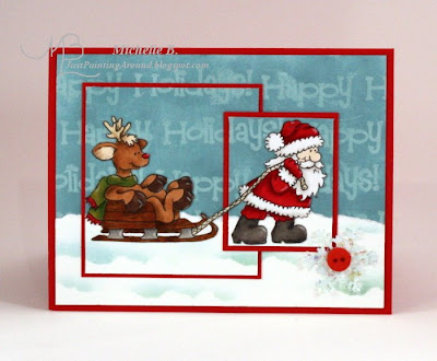
I made this about 4:30 am Monday morning but I had to get to work so I'm finally getting around to getting this posted. I am still stuck on words in my background from last weekend's cupcake adventure! Ha! I used the sketch from CCEE and I used a button for High Hopes challenge # 23.

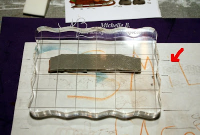
First, I'd like to show you how I lined up those words in the background. I placed my stamp in between the lines of a lined acrylic block. I transfered those lines onto a piece of scrap paper (see the little black lines). Then when I was stamping, I just moved down a row. If I hadn't done this, I would surely have crooked words! The words were stamped using Versamark ink onto Soft Sky cardstock and embossed with clear detail embossing powder.


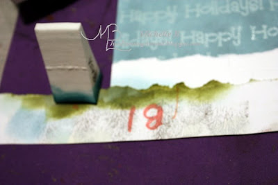
Now let's go onto those snow drifts that I promised you. First, I cut a piece of Whisper White cardstock to the size for my snow area and tore the top of it off for texture (you must use a slick surfaced cardstock like this). I used another torn piece of cardstock as a mask. You can see that this is a well loved piece! However, I made a HUGE mistake here.... DO NOT use cardstock with green ink on it when you are stamping with blue. More on that in a minute.

Ok, so I place my mask where I want to sponge staying level.


Then I sponge Baja Breeze (I recommend you start with Soft Sky for a more subtle look) onto the Whisper White cardstock. I will often go from the inkpad, to a scrap (see the blue spot on the mask below), and finally to my piece. This prevents me from getting to dark and I can identify any problems on the scrap before I ruin my piece. I always start with my sponge half on and half off the mask. I will pinch the sponge so only a little of it touches the piece and I will not get any hard edges. Then I gently work side to side and then move upward as I continue to move side to side. As I run out of ink, I'll be left with a nice soft edge. I never "double dip" meaning I only go to the ink pad once per snow drift. HINT: Some people may find it easier to turn the piece upside down and work downwards towards themselves. Please refer to my sponging tips n tricks for more info. (sorry for the blury pic)


And here is what you will have when you remove the mask. Notice that my hill ends on a downward slope. I always try to end a drift in a down position so you get a full hill not just half a hill.

Then I move the mask around and repeat the process. I wasn't trying to portray a lot of distance here but if I were, I would do bumpy hills in the front and thin flat ones in the back. Those distant hills would also be smaller left to right. I just use a smoother area of the mask to get this shape. Here's an example with the arrow pointing at a thin flat distant hill.


Now, can you see why I had a problem with that green mask? As I was sponging, some of that green transferred to my sponge. My drifts on the left are blue but by the time I get to the right, I'm lookin' kinda green! Good thing I was planning to put a button and snowflake over there! (and I'll have to throw that sponge away!).

I hope you'll give this a shot and let me know if you have any questions.


Stamps: High Hopes Reindeer Games, High Hopes Happy Holidays
Paper: Soft Sky, Whisper White, Real Red
Ink: Baja Breeze, Soft Sky (just on the snowflake)
Accessories: Copics, Prismacolor pencils and Goo Gone, clear detail embossing powder, Virsamark pad, heat gun, mica flake glitter, snowflake punch, SU button


How I color.

How I get those layers to line up across the scene: My Cut then Ink Technique

Enjoy!
Michelle B.
"Queen of the Scene"
Wednesday, March 25, 2009

SC221 Home for Christmas

Shew, this sketch for Sketch Challenge 221 was a bit of a struggle for me and I'm working on limited time before work. There are lots of odd shaped pieces, I kept cutting things wrong, and I had to tinker with my design a bit at the end. Shew, I'm barely getting this posted before work.

These are digital images and one of the benefits of digi's is that I was able to print the trees out in two sizes....large for close up and smaller for far away. Don't miss that soft little path in the snow leading you to the front door (masked and sponged.) Gotta run!

Here is how I color.

How I get my layers to line up using my Cut then Ink Technique.

Stamps: CC Designs Digi Sugarplums Snowy Scene, Punch Pals, Itty Bitty Backgrounds
Paper: Soft Sky, Whisper White, Real Red
Ink: Soft Sky, Blue Bayou, Night of Navy, Whisper White
Accessories: Copics, Prismacolor pencils and Goo Gone

Enjoy!
Michelle B.
“Queen of the Scene”

Tuesday, March 24, 2009

Tips N Tricks Tuesday # 5 - Cheaters for Trimming Images

Ooh, I've been excited about these Tuesdays...they just don't come fast enough! I'll try not to bable on too long! To refresh your memory, I'll be using this Tilda with Balloons Birthday card I did last week as my example.

So, I like to cut my images out and stick them onto my scenes. The reasons I choose to do this are many:


  • I like the colors very vibrant (emboss resist tends to alter the color)

  • I'm messy (you should see me with the embossing powder!)

  • This allows me to color on the go and have images pre-colored

  • I can allow my image to hang over the surrounding frame a bit. I LOVE that!

  • I love digital images so obviously its the best way for those

  • I have Eclipse tape (fabulous product) but I'm still learning to trust it (scared I'll smear ink underneath). Need more practice here

  • I may have received the image in a swap so I may not have the original stamp

  • I could keep going


So I've developed a few techniques to make this cutting easier. As I said, I'm messy so I always trim my images over a piece of scrap paper. Then I don't have those little pieces floating all over. I can just pick the sheet up and pour it into the recycle bin. Also, a good pair of scissors is a MUST. I use Stampin' Up's Paper Snips. I always cut the larger areas first so I don't accidentally break off any details.(you can click on these pics to make them bigger if you need to)


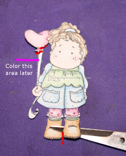
TECHNIQUE #1 CUT THRU THE IMAGE - You can cut thru the image in some strategic places to get to the white area. In the example below, you can see that I cut right on the line between Tilda's two boots (see red dots). I was able to get into that little area and cut the white paper out so the scene will show thru. I did the same thing under the pink balloon. I carefully cut along the line to get in and remove the white area between Tilda and the balloon.


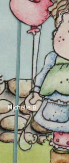
TECHNIQUE #2 CUT AROUND AND COLOR IT IN - You'll notice above that I was not able to cut the area between the 2 balloon strings. Those strings are just too thin. So, I just left the white space between them. Now, if you look at the curved parts at the bottom of the balloon strings, I had to leave some white. DO NOT cut in straight lines and this will not show as much.


When I attach the image to the scene, I color those white areas in to match what's behind them using my blender pen and ink pads. I also prefer to just dab the pen onto the paper rather than move it around - prevents pilling. (NOTE: I had to color blue, brown, and green to hide this one!) Here's a closeup of the finished card. You really don't notice that I've done this.


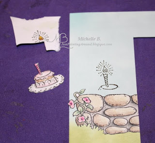
TECHNIQUE #3 PAPER PIECE IT - This is my favorite way to deal with all those little tiny details such as the glow around the candle below or Stamping Bella's little stick arms. I simply use my Stamp-a-Majig (another MUST for me) to line up where I want the image to go and I stamp it onto my scene (sometimes I just stamp the part with the tiny details as I did here). I cut out and color my image separately and just act like I'm paper piecing and glue those parts onto the stamped area.


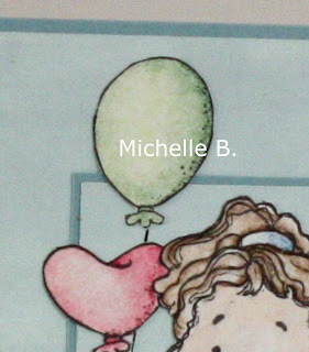
TECHNIQUE #4 DRAW IT IN - And sometimes I have no choice but to draw something in myself. As you can see in the image above, I accidentally cut off her green balloon. The string was just too tiny. So on the finished card, I drew that little line in myself with a ruler and a fine tip marker. You can barely tell the difference between the string on the green balloon and the string on the pink balloon.


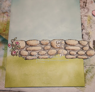
BONUS TIP - And I was really sneaky on this card with the wall. I wanted the wall to be longer than the original stamp so I simply hid the area where the two stamps meet BEHIND Tilda. Here's what it look like before I put Tilda on. Ha!


Hope these ideas save you some time and frustration in your cutting (and I'll bet you'll be zooming in on my cards more often! Ha!)

Enjoy!
Michelle B.
"Queen of the Scene"
Sunday, March 22, 2009

Did I do that?????


Um, hello, I am a SCENE stamper! Did I do this? I don't know what happened as I normally think I stink at this kind of card but I kinda like this one. Must have been Beate's inspiration as this was done for today's Featured Stamper challenge and I've used Taylor's Cupcake Sketch #60.

I really love how Beate frequently uses word stamps behind her main image and those cards always have an aged, vintage feel. Here's the card that got me started thinking of this. I think it's safe to say I've pretty much changed everything.....main image from flower to cupcake, color combo, sketch. I did keep the words behind the main image with sponging, scallops, and layers to stay true to my inspiration. Now I didn't have a large background stamp with words so I just stamped my single word over and over.

Aw, I just realized that this fulfills my requirements for my term as Treehouse Stamps Guest Designer. Kinda sad, eh?

Now, next time we'll return to our regularly featured scene stamping!

Stamps: Treehouse Stamps Birthday Cupcake
Paper: Chocolate Chip, SU DP, Close to Cocoa, Very Vanilla, Barely Banana
Ink: Close to Cocoa, Chocolate Chip
Accessories: Copics, Textile Embossing Folder, Cricut George Cartridge, Ribbon from Pink Hedgehog


Enjoy!
Michelle B.
“Queen of the Scene”

Friday, March 20, 2009

2 Birthdays


Today is Grandparents day at school so my in laws have the kids all day. I have one of those rare opportunities to just loose myself in my art and not worry about what time it is. Heaven! So I decided to do something different and not work with a sketch (every once in a while I do that to remind myself how awful I am without one!). I colored totally with Prismacolor pencils….no Copics today. And this card had all the right components for the topic I wanted to do for next Tuesday’s Tips n Tricks so I worked on that too. I actually made 2 of this card because my MIL and my aunt have birthdays next week and have similar tastes. So 4 hours later……here I am finally posting this.


Pretty simple card here (why did it take 4 hours?). I just sponged Soft Sky in the sky area with a little Cool Caribbean the corners. Then I sponged Certainly Celery on the grass with Old Olive around all 4 sides of the grass area for shadow. I attached all the pieces. It still needed a little something so I punched out those corner pieces of Pink Pirouette cardstock and stamped over them with Pretty in Pink.

When I was done I noticed that the two pink corner pieces and the pink balloon formed a triangle with the cake right in the middle. Kind of a visual trick to make sure your eye went to the cake. I like that!

And for some exciting news……I just received my confirmation that I’ll be going to Michelle Zindorf’s beginning and advanced brayer workshops here in Missouri in August. I can’t wait!!!!!


Stamps: Magnolia Tilda with Balloons, High Hopes Rock Wall, Voila, Background Sampler
Paper: Whisper White, Baja Breeze, Pirouette Pink
Ink: Soft Sky, Cool Caribbean, Certainly Celery, Old Olive, Pretty in Pink
Accessories: Prismacolor pencils and Goo Gone, Candlelight Shimmerz (on the flame), Photo Corners punch

Enjoy!
Michelle B.
“Queen of the Scene”

Thursday, March 19, 2009

Inky Impressions 1st Design Team Call

NOTE: Be sure to scroll down. This is my 2nd post today.


There is a new stamp company coming to town and you can learn more about Inky Impressions here. This post is my submission to join their design team. I have told you before that I love to paint eyes and when I saw some previews of their images I went crazy! They have big beautiful eyes I can color!! Whoo Hoo! I just HAD to apply! Complete details on the above Springy card can be found here.

For the 2nd card required for my submission, I wanted to change gears to a winter card. Complete details for this card can be found here.

I love to feature cute characters in my scenes and I thought the images from Inky Impressions would be perfect for my style!

Enjoy!
Michelle B.
“Queen of the Scene”

Mojo78 Lizzie in Red


I've had Lizzie and this house colored for quite a while waiting for just the right sketch and that time is now. The sketch from Mojo78 was perfect for this scene.

I colored my usual way. I get the various layers of the scene to line up by using my Cut then Ink Technique. The sky was sponged. Depth was created in the trees by first stamping in Old Olive (a lighter green) and then stamping darker trees in the front (Garden Green).

When I paint snowdrifts, I'll actually turn my piece upside down while I'm painting them. I ink them in a similar way. Most people put a line of blue at the peak of their snowdrifts. I like to make my drift white with a blue shadow behind it. Very realistic! I use a torn piece of paper as the mask and I actually mask off the white peak of the drift. I sponge along the top of the mask (or I guess that would be the bottom if you've turned your piece upside down). Did that make sense? NOTE TO SELF: Need visual tutorial of snow drifts! Of course, you can’t have snow without Angel Wingz Shimmerz on the drifts! And how ‘bout a little more Shimmerz on those windows!

Stamps: Whiff of Joy Lizzie with Muff, H and M Stamps Old English, Rubbernecker Kittie Kits The Moose Is Loose
Paper: Whisper White, Riding Hood Red
Ink: Soft Sky, Old Olive, Garden Green
Accessories: Copics, Prismacolor pencils and Goo Gone, Glitter Pen, Angel Wingz Shimmerz


Enjoy!
Michelle B.
“Queen of the Scene”

Wednesday, March 18, 2009

SC220 Finally Posted


So, where am I on sketch day? GRRRRR. I got up at 4 AM and made this card. When I finished it and tried to take a pic I couldn't get it to shoot at all. I finally realized I was too close because DH had used the camera last night and had put on the telescopic lense. By the time I figured all that out, I had to leave for work. DH fixed it all up for me so here I am on my lunch hour finally getting this posted.

I decided to do an indoor scene today and let Willow bake me some cookies. I used today's Sketch Challenge as my inspiration. The Willow image and this fab DP are available from Treehouse Stamps. The floor is a hand drawn image that I digitized so I could quickly use it over and over. I just print it on some Creamy Caramel cardstock and add a little shading with my Prismacolor Pencils and Goo Gone. Willow is colored my usual way.

Stamps: Whiff of Joy Willow with Cookies
Paper: Pretty in Pink, Creamy Caramel, Basic Grey Two Scoops DP
Accessories: Copics, Prismacolor pencils and Goo Gone, Glitter Pen (on her jeans), Candlelight Shimmerz (on the “steam”)

Gotta run!

Enjoy!
Michelle B.
“Queen of the Scene”

Tuesday, March 17, 2009

Tips n Tricks Tuesday # 4 - Copic Markers, Prismacolor Pencils, & Goo Gone

Oh, how I love my collection of coloring tools! I will often sit and stare at this container full of color because I think it is so beautiful. You know how much I love color!

Last week Lisa wanted to know how I store my Copics and if I take them all with me on the go. I store my Copics and Prismacolor Pencils (grouped by type and then color) in a Pampered Chef spinning thingee that I think was originally for kitchen utensils. As usual, my cheap self reclaimed this from a friend who had tired of it. I also store my purple pencil sharpener in with the purple pencils (bottom of pic). In the center circle, I store my paper snips scissors, my sand paper for my blending stumps (oh, yeah, the stumps are here too - outter ring, middle of Prismas side), and a fine black marker. This is how I keep my coloring tools on my stamp table and they are ready to go as well - no switching them from one container to another. This entire thing fits in a cloth totebag I have. I just add my folder of images to color and a clip board.


Sandy wanted to know what is up with me and the Goo Gone. I used to use Baby Oil to blend my Prismacolor pencils. I liked that it was relatively easy to obtain and relatively safe around the kiddos. I did get tired of waiting for that oily spot to dry. Ug. I didn't want to go to oderless mineral spirits as this product was not easily accessible to me and I was concerned about health warnings when my kiddos use this to. So, I switched to Goo Gone for blending my pencils and I love it!

When I used to blend my Prismas with baby oil gel, it was really easy to throw the tube in my bag and go. Now that I've switched to Goo Gone, I had to think of a new solution. We buy Goo Gone very economically in a giant container. I only needed a small easily accessible container for my coloring. So, I decided to use one of those small disposable storage containers. Just the right size but really light weight. I'm pretty clumsy so I KNEW that was an accident waiting to happen (I would definately knock it over!). I had some plaster of paris mix leftover from a Girl Scout project so I grabbed a disposable storage container one size larger, mixed up some plaster of paris in there, and put the smaller container inside. I had to do some weighting down (canned good) and proping up (popcicle sticks) to get this just the right height for it to dry at. NOTE: If I transport this, I carry it outside my tote bag so I can keep an eye on it. Don't want anything spilling out of here!

Hope that answers your questions and gets ya thinking. More questions are welcome of course!

So, do you want to know what I'm going to post next week or shall each Tuesday be a surprise?

Enjoy!
Michelle B.
“Queen of the Scene”

Sunday, March 15, 2009

FS110 O’s Bday


Today I’m casing a card from Twinshappy, our featured stamper of the day. Wow, I think she was described as prolific and that is an understatement. How could a girl choose from that many awesome cards?!?!

So, I narrowed it down by trying to find something I could case for a birthday card I need to make for “O”. He and his wife have a white camper and white truck that they travel around in quite a bit. So, I choose this card to case. I kept the outdoors, woods, mountain feel but changed up the main images to camping rather than fishing. I also changed up the sketch and color scheme. Shocker - I even made up my own sketch today!
Here's how I made the mountains. Where the base of the mountains hit the tree line, I just drug the ink down into the tree area letting it just fade off into nothing. The tree area follows one of the rules of perspective .....Things in the back are lighter and have less detail and things in the front are darker and have more detail. The tree area was first sponged roughly with Kiwi Kiss. Then I stamped small trees in Old Olive up near the sky line. Next, I stamped the larger trees in Garden Green and put them down closer to the "road". This created a fabulous sense of depth in my woods....like they go on and on into the distance. Here is how I color my Riley's.
Stamps: Hanna Stamps Trailer Riley, Hanna Stamps Van Riley, Hanna Stamps Things Hanna Would Say, Rubbernecker Kittie Kits The Moose Is Loose
Paper: Whisper White, Chocolate Chip, Baja Breeze
Ink: Soft Sky, Close to Cocoa, Chocolate Chip, Kiwi Kiss, Old Olive, Garden Green, Going Grey, Basic Black
Accessories: Copics, Prismacolor pencils and Goo Gone, Glitter Pen, White Gel Pen, Nesties
Enjoy!
Michelle B.
“Queen of the Scene”

Saturday, March 14, 2009

1st Birthday Cupcake


Did you ever feel like you weren't going to have time to make a card ever again? That's kinda how I've been feeling. Tomorrow is my niece's first birthday party and I thought this new cupcake image from Treehouse Stamps called Birthday Cupcake was perfect for her!


Now, you know me. I couldn't just slap that cupcake on the card and call it done. I had to add 101 details! Ha! So, first I created the table by sponging a little Certainly Celerly ink along an oval shaped mask. You can learn more about how I make tables here. Next I sponged a little Pretty in Pink ink on the upper corners of a piece of Pink Pirouette cardstock for my wall.


The cupcake wrapper was stamped on some Basic Grey DP (also available from Treehouse Stamps). You can't really tell in the picture but I ran some score lines along the creases in the cupcake wrapper using my Score-Pal. I used a little Dark Brown Prismacolor Pencil along the top and sides of the wrapper for shadow. This was pieced onto the main card. I stamped the cupcake top on Chocolate Chip paper and cut out just the "cake" portion and layered that onto my main card. Finally, I stamped the cupcake one more time on Georgia Pacific 110 Cardstock. The candle and flame were colored my usual way. This piece was placed a little higher than indicated on the original stamp so I could let a little "cake" hang out. Then the fun began....I used White Opal Liquid Pearls for the icing. I covered the candle in Glossy Accents for a shiny waxy look. I added Candle Light Shimmerz to the flame. The sentiment banner was hand cut and the center is curved out a bit.


What was I so busy doing all day? I also made my niece's cake


and her little mini cake that she can dig her hands into:


Stamps: Treehouse Stamps Birthday Cupcake
Paper: Certainly Celery, Pirouette Pink, Regal Rose, Chocolate Chip, GP 110, Basic Grey DP
Ink: Chocolate Chip, Certainly Celery, Pretty in Pink,
Accessories: Copics, Prismacolor pencils and Goo Gone, Score-Pal, White Opal Liquid Pearls, Glossy Accents, Candle Light Shimmerz

Enjoy!
Michelle B.
“Queen of the Scene”


I

Thursday, March 12, 2009

WT209 Doctor Lily


I’ve had this lily in my inky little hands for a couple of days but I wasn’t sure yet how I was going to use it. A little trip to the doctor office this morning provided the answer. There on the wall was a set of prints that looked very much like this card.

I didn’t think I was going to be able to enter today’s challenge because I couldn’t think of anything I could reuse this morning. When I was almost done here, I was thinking it looked a little flat. I added the ribbon but it still wasn’t quite right. I decided what it needed was more dimension – maybe put that center lily up on pop dots. Lucky for me…my first attempt at this didn’t make it to completion so I simply cut the lily out from that failed attempt and reused it on this card.

This lily image will be available thru Treehouse Stamps tomorrow (3/13/09)!


I started out by stamping the center lily (putting my stamp into the Virsamark pad first, then the Chocolate Chip ink, and finally to the paper). I heat embossed it with clear detail embossing powder. I masked this guy off and stamped the other two lilies. I colored them my usual way. After coloring, I used the Virsamark pen to fill in the images completely and them embossed them with the clear detail embossing powder.
Next I used posted it notes to mark off the Chocolate Chip area. I roughly sponged Creamy Caramel on the right and bottom. I wanted it really rought so I also drug the pad thru the area and then softened that a bit with my sponge. Finally, I masked off the Creamy Caramel area and sponged in the Chocolate Chip, going heavier at the edges and lighter towards the center. I added the ribbon (twisting it before I adhered it) and put that repurposed lily up on pop dots in the center.


Stamps: Treehouse Stamps My Mom
Paper: Whisper White, Apricot Appeal, Chocolate Chip
Ink: Chocolate Chip, Creamy Caramel
Accessories: Copics, Prismacolor pencils and Goo Gone, clear detail embossing powder, heat gun, Versamark pad, Virsamark pen, ribbon from Pink Hedgehog, piercing tool


Enjoy!
Michelle B.
“Queen of the Scene”

Wednesday, March 11, 2009

The Garden Path


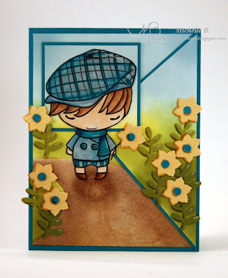
As soon as I saw the sketch, this little angle on the bottom right looked like a path to me. So, Ian’s taking a little walk thru the flower garden today! If I don't immediately see a scene in the sketch, I'll turn it 1/4 turn until I "see" something.
I intended to cut off his head and place it in the box but he was just too cute…I couldn’t do it. So he is still in one piece and I let his neck and body go over all the layers. In trying to put a little shadow under his body, I think I created a pothole on the path! Ha! This cute image is available thru Treehouse Stamps.
Most of the usual stuff here:
How I get my layers to line up: The Cut then Ink Technique
The flower stemps are a punch from EK Success. The flowers are punched with a Stampin' Up punch and the flower centers were punched with my Cropodile. I could have just glued these punched pieces on but...I think they look really cool and have a lot more dimension by adding a dark Copic marker line along the left side and a little white highlight from a white Prismacolor pencil on the right.
Stamps: The Greeting Farm Hello Ian available at Treehouse Stamps
Paper: Whisper White, Taken With Teal, Kiwi Kiss, Old Olive, Bazzill
Ink: Baja Breeze, Soft Sky, Kiwi Kiss, Old Olive, Creamy Caramel, Close to Cocoa, Summer Sun
Accessories: Copics, Prismacolor pencils and Goo Gone, punches from Stampin’ Up and EK Success, Cropodile
Enjoy!
Michelle B.
“Queen of the Scene”

Tuesday, March 10, 2009

Tips n Tricks Tuesday # 3 - Coloring Images on the Go


I like to have images colored and ready to go so when I see a sketch challenge, I can get right to it....even if I have limited time.

Most of my coloring is done away from my stamp area. This could be in front of the TV while my family is watching a movie or while I'm waiting for my daughter at dance. DD is a competition dancer so there are lots of hours spent waiting at practices or waiting for her turn to perform. This past weekend we were at a competition 8+ hours for her 5-3 minute performances.

I needed a way to transport my images without damaging them and so I could just "grab and go" when I was running out the door. So I "reclaimed" this folder from my son and added a few sheet protectors (you'll soon catch on that I love sheet protectors!).

The first section of this notebook is for images to color. It used to be just one sheet protector with a variety of images but it has now grown. The images are organized by manufacturer (in case I need a particular one for a challenge or because sometimes I just feel like coloring a certain way).
I trade images a lot so I recently started putting one image right into this folder before filing the rest away. This helps me really use those images. When I buy a new stamp, I add that image to my folder as well.

The next section is titled "to Prisma". Sometimes I don't feel like messing with the Goo Gone and my Prismacolor pencils or I might not have a table to put the Goo Gone on if I'm at a dance competition with my DD so.... I'll only do the Copic part of my coloring and then place those images in here. (sorry for the image with the X on it....there are several of these on one page and I was testing some colors. The good ones are hidden behind the other images.)

If you are unfamiliar with how I color, please see this post.


The final section of my notebook contains images that are ready to be cut and used. I don't normally cut ahead of time because I'm worried about damaging all the small details.
Hope that gets ya thinking.....

Enjoy!
Michelle B.
“Queen of the Scene”

Saturday, March 7, 2009

Get Well...or Else!


I have loved this little medicine man since I first saw him. He cracks me up! My colors were inspired by this piece from today’s inspiration challenge. The sketch is from Beate’s WSC71. I also added some Basic Grey fibers to his hair for the “That Fuzzy Feeling” High Hopes Challenge (Thanks to Deb for sending me those for Christmas!)

All my usual things here except the jungle. I really like how this turned out even though I was keeping it simple. I sponged Kiwi Kiss over the jungle area. Then I stamped the banana leaves (just the top) in Old Olive (Thanks to JenMarie for sending this stamp to me for Christmas!). I did mask some leaves off (quickly with some torn sticky notes) and stamp a few more leaves. Then I sponged some Old Olive along the bottom of the jungle. I think it's cool and a bunch of colored jungle leaves would have really taken away from my little man and his brew.

How I color.
How I get my layers to line up: Cut then Ink Technique.

Wondering where I've been all week? Well I've been dog sitting a 75 lb dog. Now remember I have a little tiny 15 lb dog. It's been a busy week of petting, feeding, walking, repeating!

Now I'm off to DD's dance competition for the rest of the day! Enjoy your Saturday!

ETA: Oops! I forgot the "recipe"
Stamps: High Hopes Medicine Man, High Hopes Bubbling Brew, High Hopes Banana Tree
Paper: Whisper White, Pumpkin Pie
Ink: Baja Breeze, Soft Sky, Kiwi Kiss, Old Olive, Creamy Caramel, Close to Cocoa
Accessories: Copics, Prismacolor pencils and Goo Gone, Fibers from Basic Grey

Enjoy!
Michelle B.
"Queen of the Scene"

PS: In case you are wondering....no, I didn't make a High Hopes Guest Designer spot. My style just isn't what design teams are looking for. And I'm ok with that because I like what I do and wouldn't change it for anything!

Thursday, March 5, 2009

I Paint for Stamps

My friend Lisa nomated me for this award a few days ago and I keep forgetting to post it here. Sorry bout that! Thank you Lisa!!!! Be sure to check out Lisa's blog, she's been ROCKING!


So if you'd have told me a couple of years ago that I'd do a wall mural job and use the money to buy stamps, I totally wouldn't have believed you. But here I am!

Last week, I painted this border for a friend's aunt. She has lived in this house for 30 years and finally had the chance to remodel the kitchen. I was honored to provide the finishing touch. I painted some soft vines, a couple of birds, some bees, and one special ladybug for luck. This job was about 20 feet of border and took 2 hours and 45 minutes. Here's a close up:


Note: I did not draw anything on this wall. I totally painted this freehand. The only thing I did was place a tape line at the "top" of the area I put the vines in to keep them somewhat even in height. I love doing wall murals - it takes some guts and a little bit of insanity! Ha! Now what stamps will I buy.....hmmmmmmm.

PS: So I finish this job and go to take a pic and when I turned the camera on....yep, battery died. Luckily, this sweet lady was kind enough to let me borrow her camera and emailed me the pics!

Enjoy!
Michelle B.
"Queen of the Scene"
Wednesday, March 4, 2009

SC218 Spring Evening


Tired of snow? I thought a Spring evening catching butterflies might cheer you up! I was also tired of doing regular old blue skies so I went for a colorful sunset here. This was created for sketch challenge 218.

I did my usual coloring of Wendy and my Cut then Ink Technique for the layers. There are Shimmerz on her wings and glitter pen on the butterflies. I wanted to add some flowers down in the grassy area but I'm running out of time. I'd love to stay and chat but I'm going to be late for work!!!

Stamps: Stamping Bella Wendy Papillon
Paper: Whisper White, Real Red
Ink: Old Olive, Garden Green, Pretty in Pink, Summer Sun, Soft Sky, Baja Breeze
Accessories: Copics, Prismacolor pencils and Goo Gone, glitter pen, fine black marker, Angel Wingz Shimmerz

Enjoy!
Michelle B.
“Queen of the Scene”

Tuesday, March 3, 2009

Tips n Tricks Tuesday # 2 - Using Sponges

Hello! It’s Tuesday again! Last week we talked about the sponges and this week we’re going to talk about how to use them…this will be especially geared toward using sponges to color your backgrounds. Grab a seat cause I’m gonna talk a while!

CORRECTION:
I did go back and make one correction to last week’s post to say that I didn’t invent the idea of using makeup sponges but that I don’t remember where I saw it first so I was unable to give the proper credit.

PAPER:
OK, the first important thing I learned about sponging is that you must use a good paper. I prefer Stampin’ Up Whisper White because it has a slightly slick surface and allows you to move that ink around a bit. (more on this later).

PREVENTION:
I always put something underneath the piece I'm sponging, either an old scrap of paper or if I’m sponging across a scene that is in pieces, my old Cricut mat. This prevents me from getting ink all over the place (which will later transfer somewhere I don’t want it to!). Don't forget to wipe that Cricut mat off when you are done.


LIGHTER FIRST:

If I’m going to be sponging two totally different colors on a piece…such as blue sky and green grass…always do the lighter color first. If you do the darker one first and then accidentally touch your light sponge to the darker area, you’ll have a mess. For example, if you do the grass first and touch your blue sky sponge to the green grass, you'll have yellow in your sky. Yuck!


THIS WAY:
I always start on the outsides of the piece (half on and half off) and move in. I usually like my pieces to be darker around the outside and lighter in the center to draw your attention to the middle. Starting at the outside will allow me to get some gradual shading inwards if I want. It also prevents me from getting a big dark blob in the center if I have too much ink on my sponge. I often will put just a tad of a darker color in the corners of my piece. For example, I’ll use Old Olive for my grass and then just add a bit of Garden Green in the corners like I did here.

If I’m using a mask, like when making my clouds, I always start with the sponge half on the mask and half on my piece.


THE MOTIONS:
OK, so I dab dab dab into the ink pad with my sponge. Then I move to my piece and with my sponge kinda half on and half off the cardstock, I dab dab dab onto the cardstock as I move inward on the cardstock. This will leave me with a bunch of “sponge prints”. This is partially because I don’t have enough ink on the cardstock yet. So I dab dab dab into my ink pad with the sponge again. Then I go to the cardstock and this time I swirl swirl swirl. Swirls = little circles as I move across the cardstock. These little circles help me blend the color in. Then I move to the next section.


BLENDING:
If you are going to be blending 2 similar colors together such as Baja Breeze and Pacific Point (which are great for sky and water but I did my example upside down! Ha!), first sponge the Baja Breeze into its area and then a bit into the area where you will put the Pacific Point. Next sponge the Pacific Point into its area and into the Baja Breeze a bit. Finally, go over the line where the two colors meet with Baja Breeze again. In the pictures below, I used Georgia Pacific 110 (which is my favorite to color on but not for sponging) on the left and Stampin' Up Whisper White on the right. See how much smoother the WW is! Also, your sponging will smooth up some more when its dry.


PINCHING:
If I’m trying to put just a fine line of sponging, like when I’m doing my clouds, I will pinch my sponge a bit so that I don’t get any of those hard edged “sponge prints” on my piece.


Shew, I think I’m done spouting now. This topic would have been great on video but I haven’t had a chance to figure that out yet. If you have any questions, please feel free to post in the comments and I’ll include the answers at the beginning of next Tuesday’s post.


Enjoy!
Michelle B.
“Queen of the Scene”

Sunday, March 1, 2009

Clearly Layered Winter


This was fun! I won this clear acetate card blank from Short Cuts via my friend Joy's blog. I new immediately what type of card I wanted to make with it.

Years ago, I used to paint what are called Float Frames which are basically two pieces of glass that you sandwich your pictures in between. I would paint both layers of glass so that some parts of the painting were behind your pics and some in front. Here's an example where the stripes would be behind your picture and the wedding bells would be in front of your picture. (and I still have this frame if anyone is interested in purchasing).


So let me try to explain how this fits together. I wanted the snowy hills on the front to cover up the area where we will sign our names. So, on the front of the clear cardbase I have just the snowy hills and deer.


On the inside, I have the trees and sky.


Here's a side view:


The inspiration for my scene came from today's Featured Stamper, Kelly_H. I chose to case this card. I changed 1) the stamps but kept the same feel 2) the arrangement of the images (my trees are behind the deer vs. in front) 3) I didn't glitter the entire image but only small snowy areas (yep, I'm chicken to use that much glitter!)

Now, as to the scene itself, I brayered some Pacific Point onto my WW CS and then I stamped my favorite trees from Treehouse Stamps in Night of Navy. As I always do with silhouettes, I ran a fine black marker around areas on the left side of the trees and I ran a white gel pen around areas on the right side of the trees. This gives them so much dimension!

For the front, I tore some snowy hills and sponged a little Soft Sky so it would be BEHIND the hills (as a shadow). I wanted some sparkle to my snow so I ran the glitter pen over the torn edges and rubbed it around with my finger. The deer is a Martha Stewart punch a friend shared and it was originally white. I sponged it in Night of Navy and gave it the silhouette treatment (black on the left, white on the right).

Stamps: Treehouse Stamps Jolly Snowman
Paper: Whisper White,
Ink: Pacific Point, Night of Navy, Soft Sky
Accessories: MS deer punch (a PIF), Fine black marker, White gel pen, glitter pen, clear cardbase from Short Cuts


Enjoy!
Michelle B.
“Queen of the Scene”